01. The Challenge: Closing the Trust Gap
"I don't trust the translation app to understand my severety. I don't trust the waiter's preference". It's a medical necessity where a single crumb ruins the trip. The primary source of friction lies in the overwhelming cognitive burden of constantly evaluating risks, coupled with the apprehension of miscommunication in high-stress, foreign settings.
I built Celio because I live this. The goal was to close the Trust Gap that exists when you hand over a translated note and just hope it works. Existing solutions are often clinical, require server dependence, and increase anxiety. These are luxuries you don't have when you're hungry in a remote Italian village.
02. The Strategy: A Survival Kit Approach
Celio is more than a tool; it's a survival kit rooted in strategic design. It tackles the problem by focusing on communication reliability and vetted information:
1. The Translation Card
The Translation Card: The heavy lifter. It translates needs with urgency and clarity, using the Web Speech API for vocal communication.
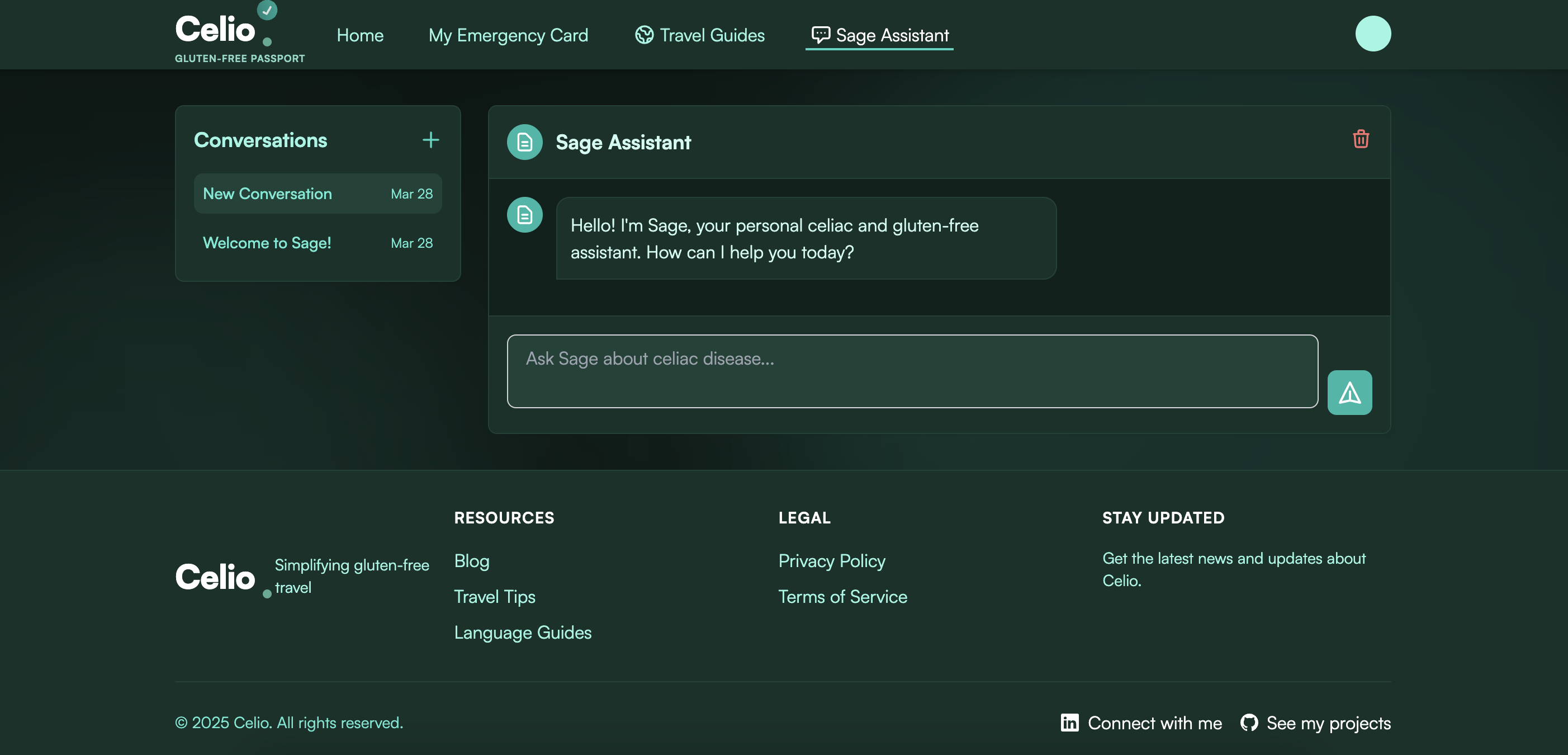
2. Sage AI
Sage AI: The integrated AI assistant. By consolidating Travel Guides into the chat, users get vetted, safe recommendations and information instantly, reducing siloed workflows.
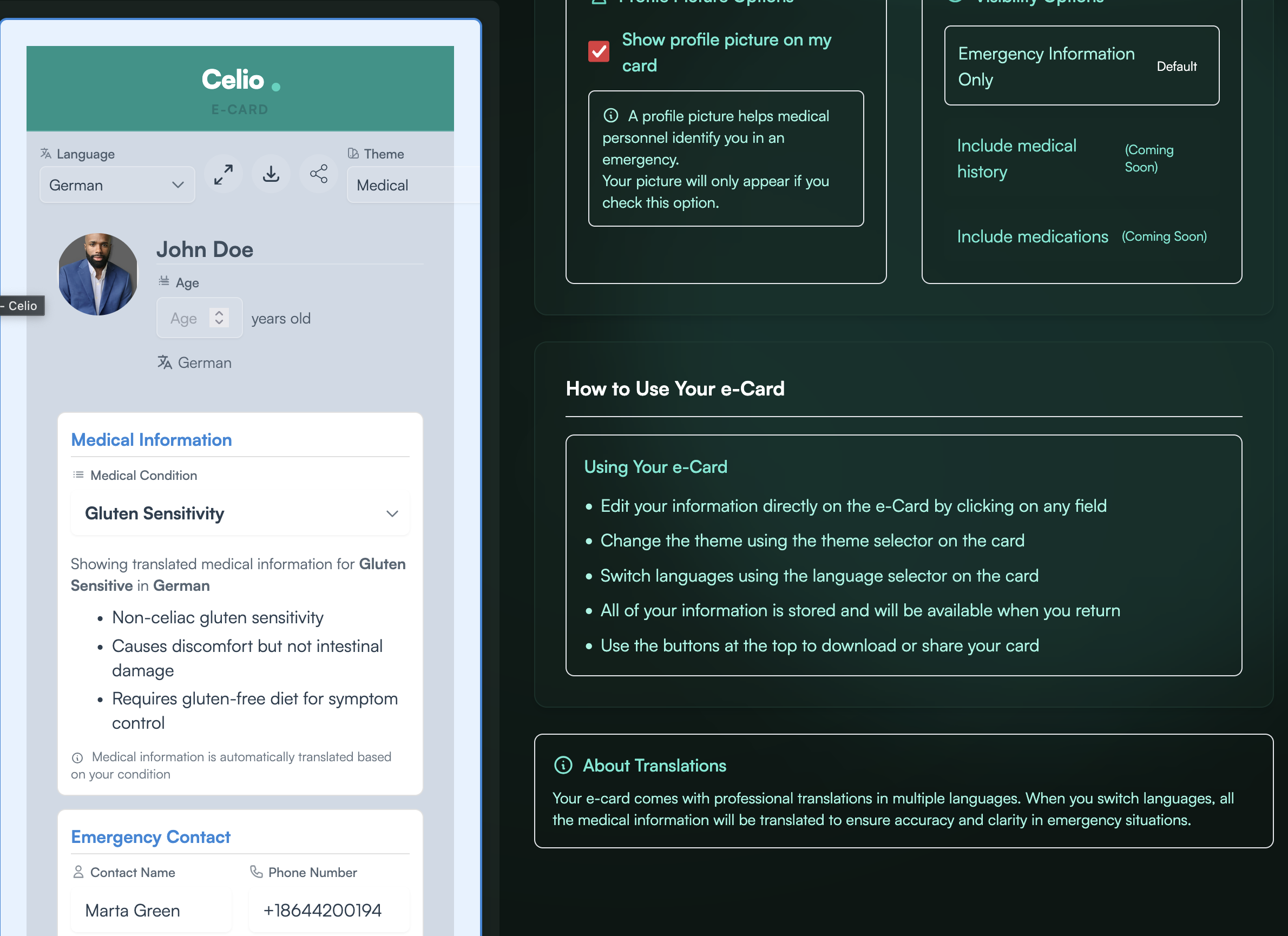 Early E-Card: Functional but lacked visual urgency.
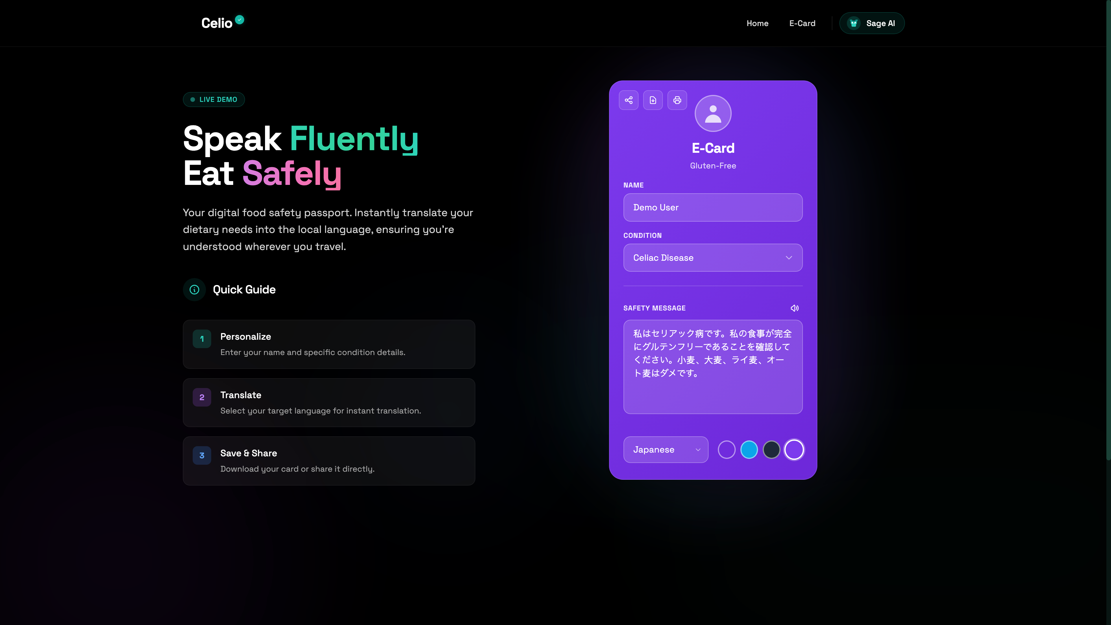 Final E-Card: Bold, clear, with audio support.
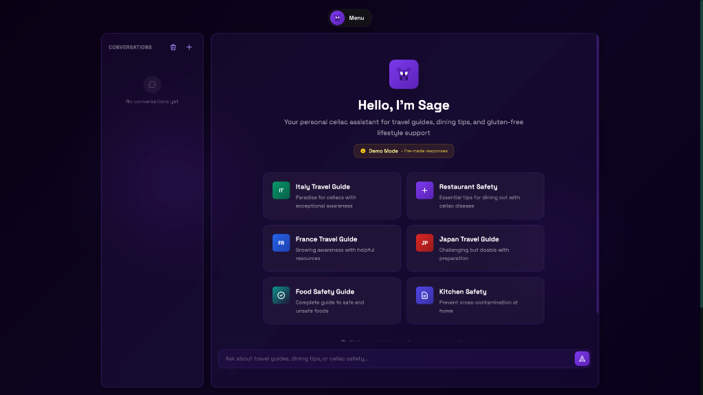
 Early Sage AI: Cluttered, text-heavy interface.
 Final Sage AI: Clean, conversational, dark mode interface.
03. Discovery: Hypothesis Driven Research
I didn't guess; I initiated a qualitative research phase (N=12) with severe allergy travelers to establish design hypotheses. The consensus was clear: anxiety directly stems from a lack of control and communication integrity.
Insight: The "Audio Mandate"
10/12 participants feared staff wouldn't read the screen. This mandated Offline Audio Support, which uses the Web Speech API to ensure the safety message is verbally heard, literally solving an accessibility issue.
Insight: Lag Creates Doubt
Users equated UI lag with system unreliability. This drove a technical pivot to Alpine.js for client side state management, eliminating server reloads. The result is an instant, native feel that builds crucial trust through performance.
04. Technical Feasibility and The Code
I chose a simple but robust stack. Django anchors the backend for scalability and handles complex i18n translations. Crucially, Alpine.js manages the frontend state, providing that necessary "snappy" feel without the bloat of larger frameworks.
The most critical technical decision was ensuring Offline First persistence. The Card caches the target language and safety messages locally, guaranteeing communication ability even when signal is lost in a subway or a remote village.
05. Outcomes, Learnings, and Growth
Celio confirms that our focus must be on trust, not data display. By rigorously testing the human emotion surrounding the product, I created a tool that empowers users to confidently say "Yes" to that dinner invitation. The project taught me that hypothesis driven research is mandatory to ship a truly accessible and robust solution.
Try Celio Now →06. Why I Built This
I started building Celio shortly after a trip to Mexico. Communicating my allergy needs to resort staff was genuinely difficult, and it got worse at airports where I was trying to order food quickly with no shared language. Celio came out of that frustration. At its core it reduces the anxiety that comes with eating safely when you have a food allergy abroad.
One of the most difficult things about having celiac disease is communicating it while traveling. That gets even harder when there's a language barrier. You're not just explaining a preference — you're explaining something that makes you sick. Celio exists to make that easier.
07. Research Process
Before I wrote a single line of code I spent two months talking to people.
I found participants on Reddit, Facebook, and Discord. Some were reluctant at first but most opened up once they understood what I was building. I also recruited friends, family, and classmates. At one point I had over 50 people actively using the app and giving feedback. That level of engagement told me the problem was real and the solution was resonating.
Research Question 1
What does communicating a dietary need abroad actually feel like in the moment?
Research Question 2
Where does the fear live — before the meal, at the table, or after?
Research Question 3
What would genuinely make someone feel safe?
The feedback that surprised me most led to the audio feature. I hadn't planned it — users brought it up on their own. They also asked about Apple Wallet integration and flagged that the interface felt laggy, which I ended up fixing by switching to Alpine.js. Those three things came entirely from listening.
08. What Changed Because of Research
The card felt sluggish
Participants described the e-card as laggy and slow to update. It wasn't smooth. I traced the issue back to HTMX and switched to Alpine.js which made interactions instant. A tool people use in stressful real-world situations can't feel hesitant.
Text alone wasn't enough
Staff at restaurants were used to translation apps having audio. Without it there was tension — showing a silent screen only worked about half the time. Users felt noticeably more confident once audio was added and so did the staff they were communicating with. Safety goes both ways.
It needed to work under pressure
When I heard people describing real struggles using the card in live situations I went straight into problem solving mode. I wanted it to be intuitive enough that someone could use it while stressed, standing up, handing their phone across a table. That meant rebuilding the UI with simplicity and responsiveness as the priority, not just functionality.
People were using it in ways I didn't expect
A few users told me they'd used Celio at weddings and catered events — they just sent a PDF of their e-card when asked about dietary preferences. That felt great to hear. I built it for restaurants abroad and people were extending it into their everyday lives at home.
Apple Wallet makes complete sense
The Apple Wallet has essentially replaced the physical wallet for a lot of people. Adding the e-card there is just another layer of safety on a trip. Users already trust it. Having your allergy card one tap away without opening an app is exactly the kind of friction reduction that matters when you're in an unfamiliar place.
09. What I Learned
Building Celio taught me that research isn't optional when you're building something real. You can have a great idea and still get the product wrong if you don't understand what people actually need. The audio feature, the Apple Wallet request, the interface feedback — none of that came from me sitting alone thinking about the product. It came from listening. That's the part I'll take into every project going forward.